
This was the best Project that never was.
Tregaron Capital is a private equity group based out of Palo Alto, California. When Companies are approached by Tregaron Capital, transactions can range up to $25MM. The project's highest priority was to establish trust between the user and their financial information through a familiar digital surface. With this in mind, we used the mental model human's use when interacting with automated teller machines (ATM's).
Everyday, people deposit and withdraw their money through an ATM. People trust ATM's. We wanted to mirror that feeling. The idea here is to dissect the process of selling your Company in an M&A transaction into the experience of navigating the site. The strongest evidence of this can be seen in the sub-navigation “badges” we used. Take a look at one example below:
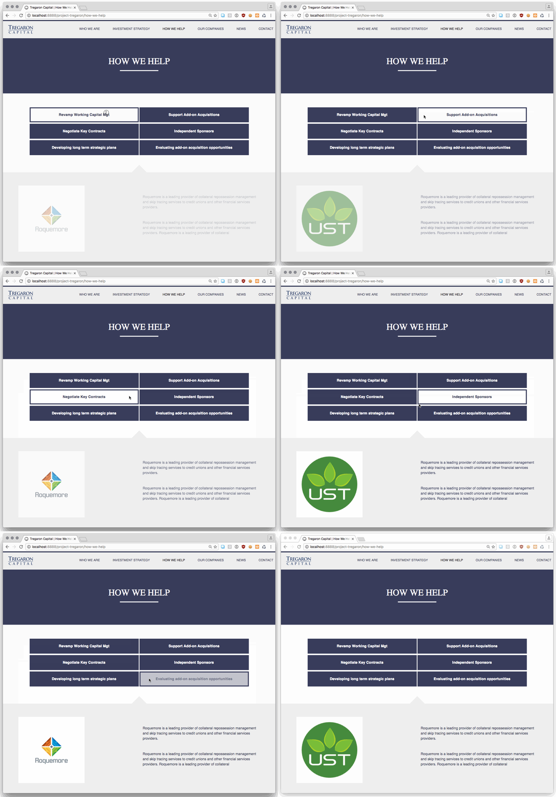
The most experimental part of the project was use of a tertiary navigation -- the key take-away being that more than 2 selections in the tertiary navigation is too much. The ability to layer large datasets comes at a cost when simplifying the interface.
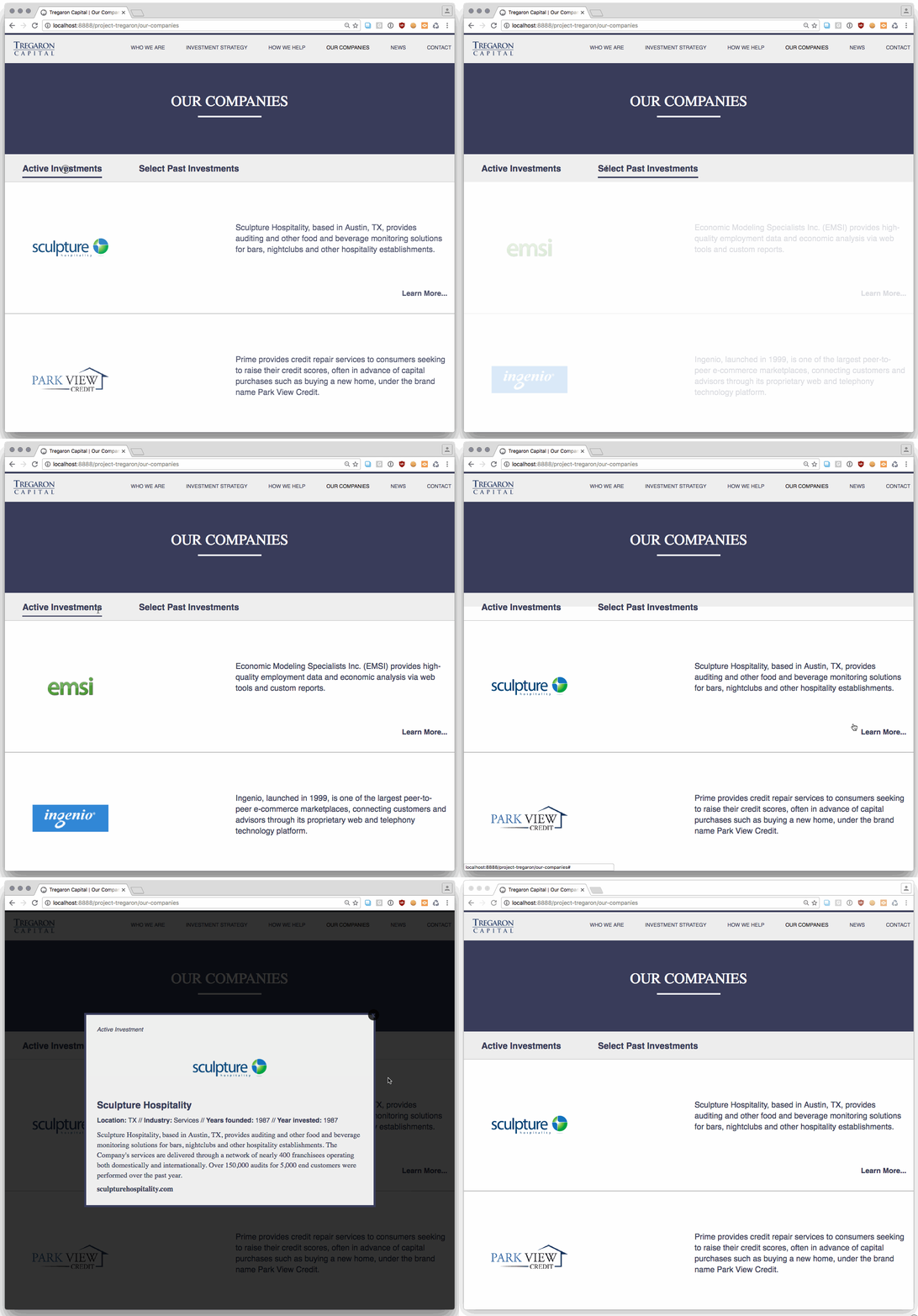
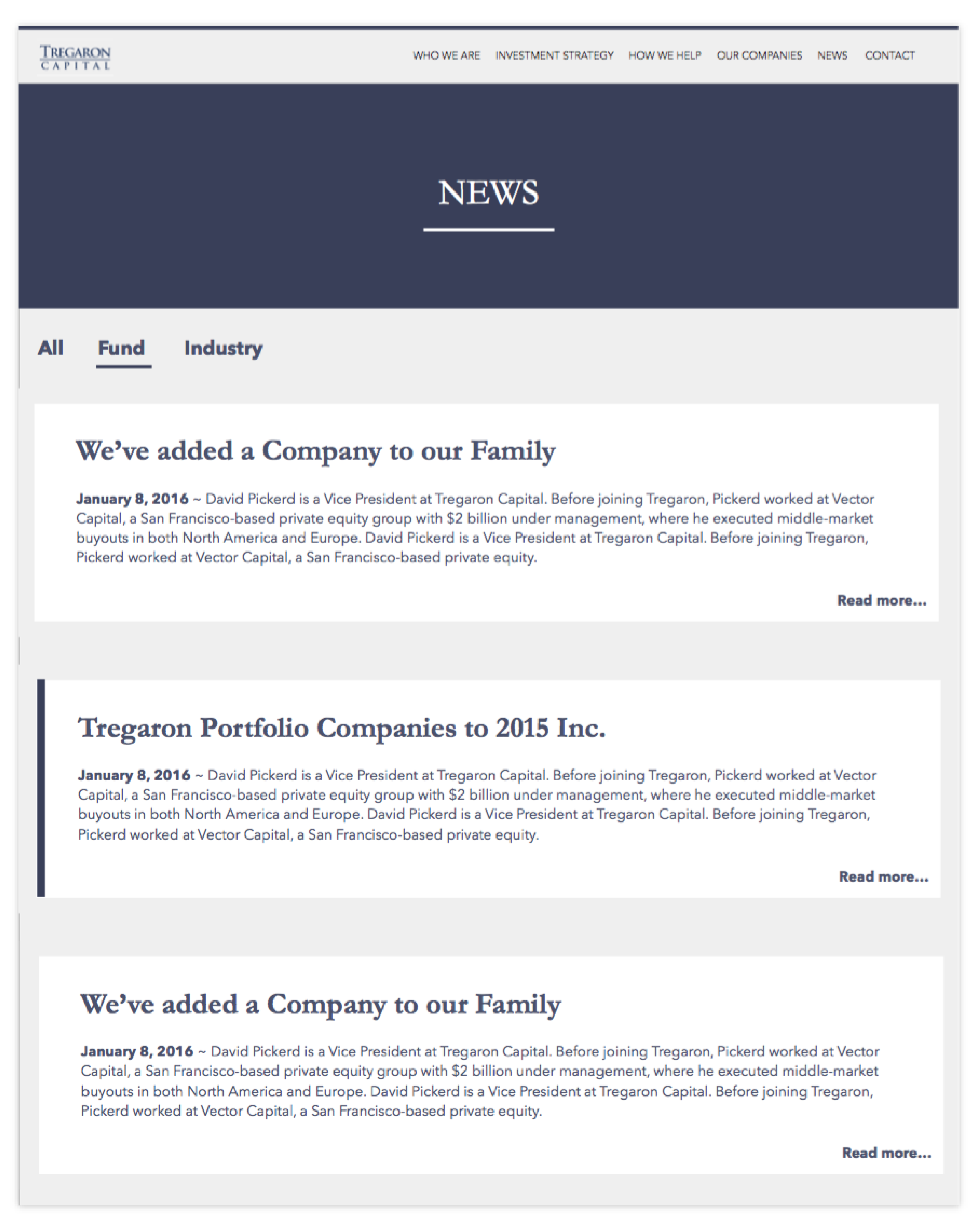
Other favorite parts of the site:
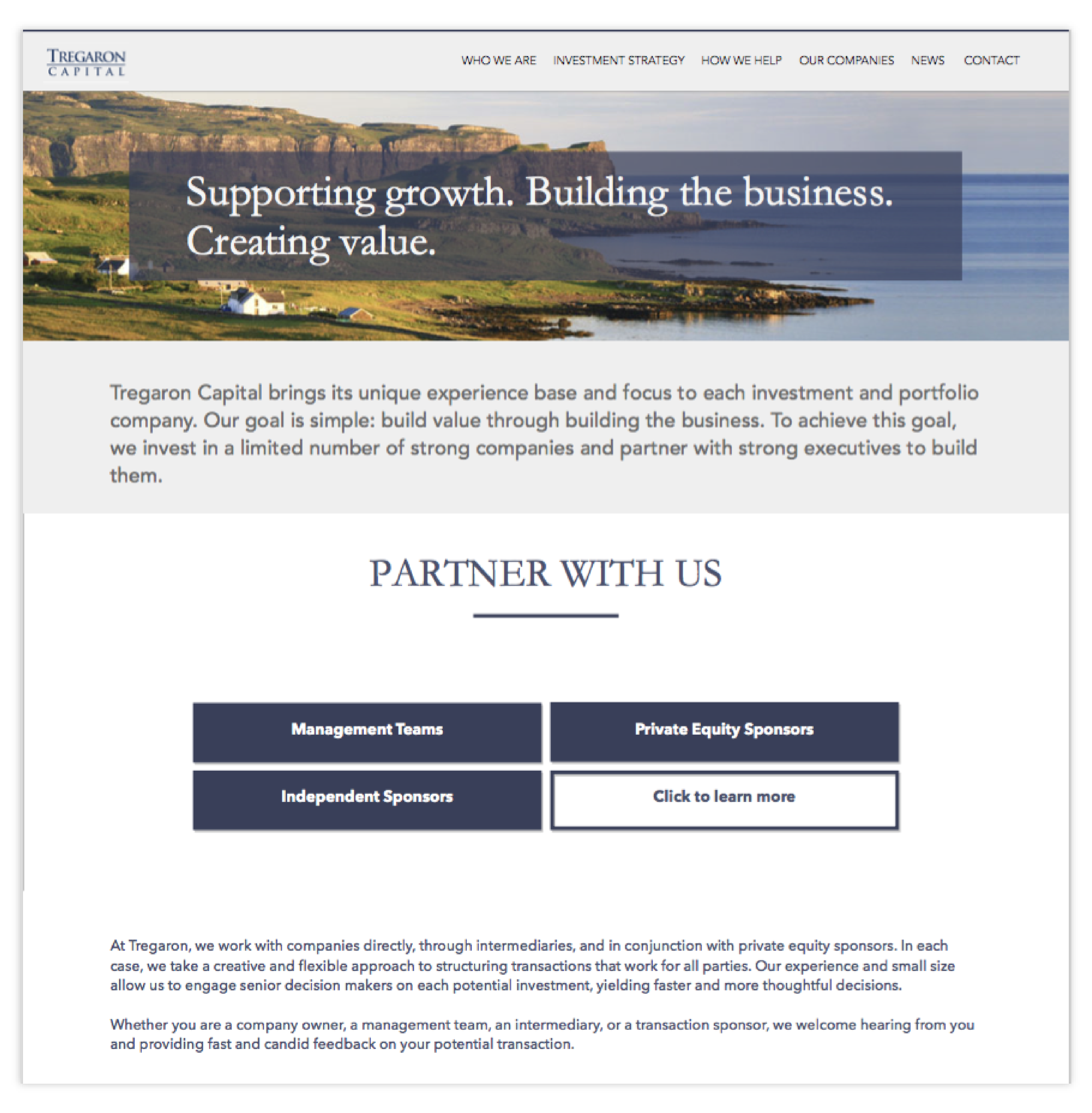
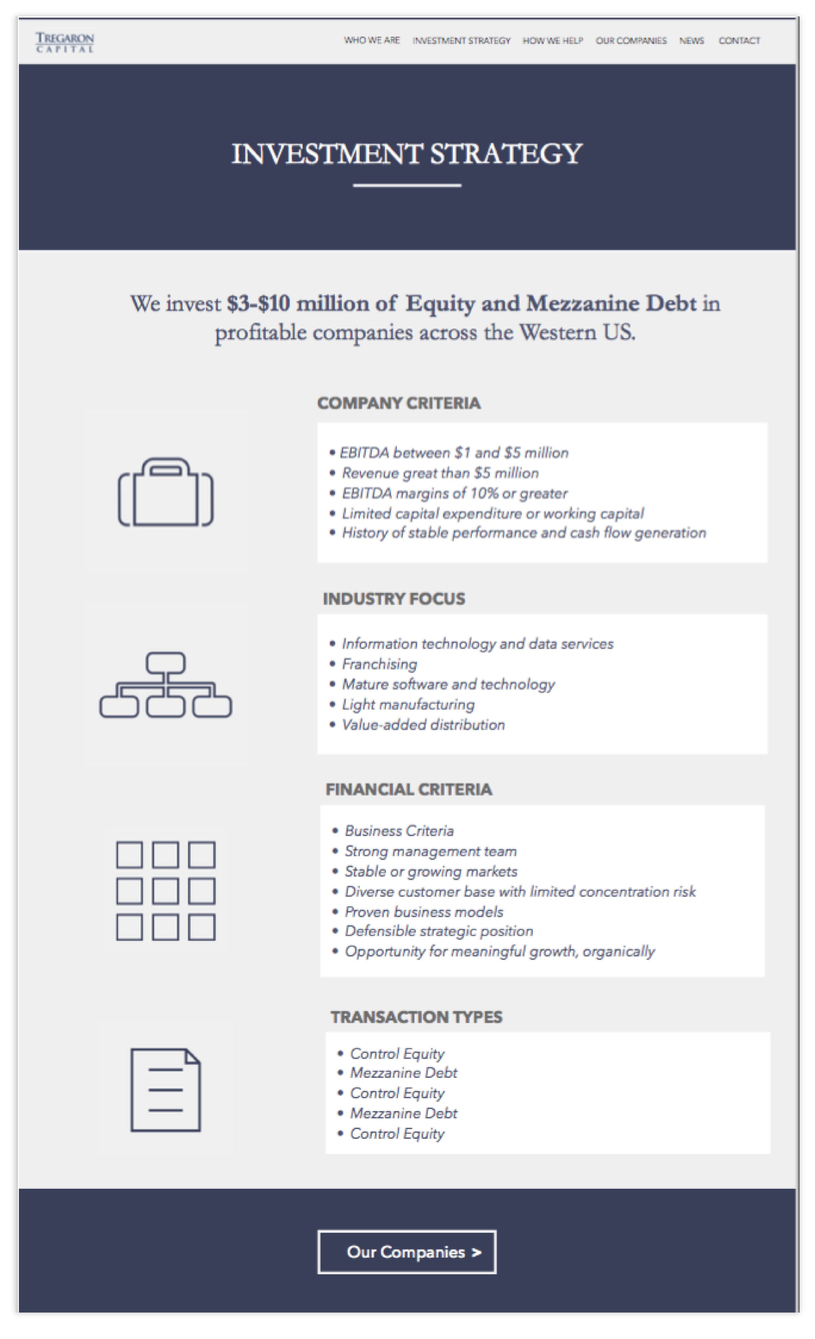
The biggest lesson learned from this Project was the importance of managing expectations. We went through 18 versions of the wireframe and by the end of the 18th version, the Client was extremely fluent in Design and could hold conversations about the UX. Sometimes it is better to draw a firm line in the sand or you may lose sight of the bigger picture.
