
We began working with CAPTARGET when they were 3 people in a converted can factory. The first iteration of the logo was designed by Randy.

According to Randy, the original layout of the logo was inspired by the all-seeing eye on the dollar bill. He felt this was fitting for a company servicing Investment Banking and Private Equity. After all, cash rules everything around me.
Our take on the next version was synchronized with CAPTARGET's expansion and re-structuring into three distinct business units. These are the colors we decided on:

Each color represents a business unit all umbrella'd under the main logo:
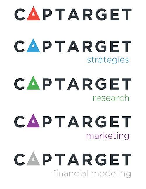
Up until this point, CAPTARGET's audience had trouble distinguishing between the different service offerings and where they overlapped. The design thesis was to better visually communicate the four core services to the outside world.
The site was also re-designed to reflect the newly defined business units.
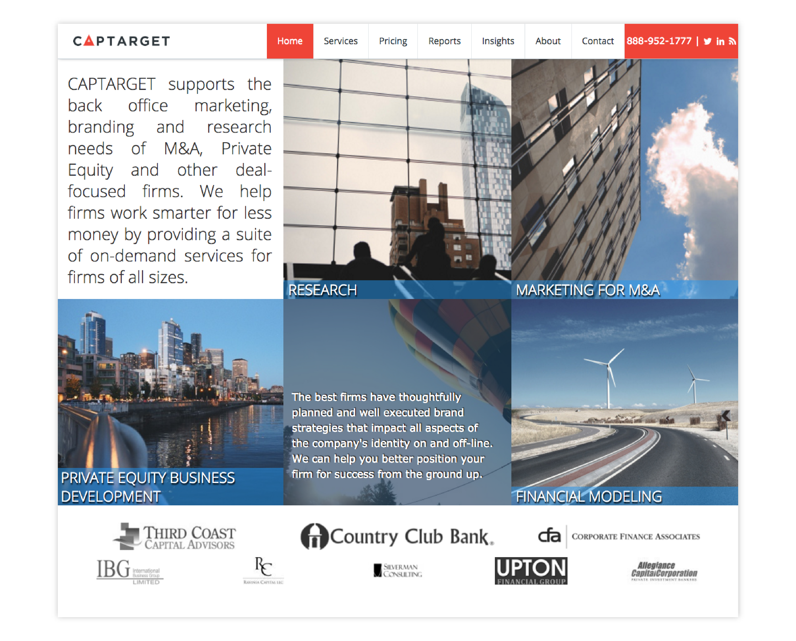
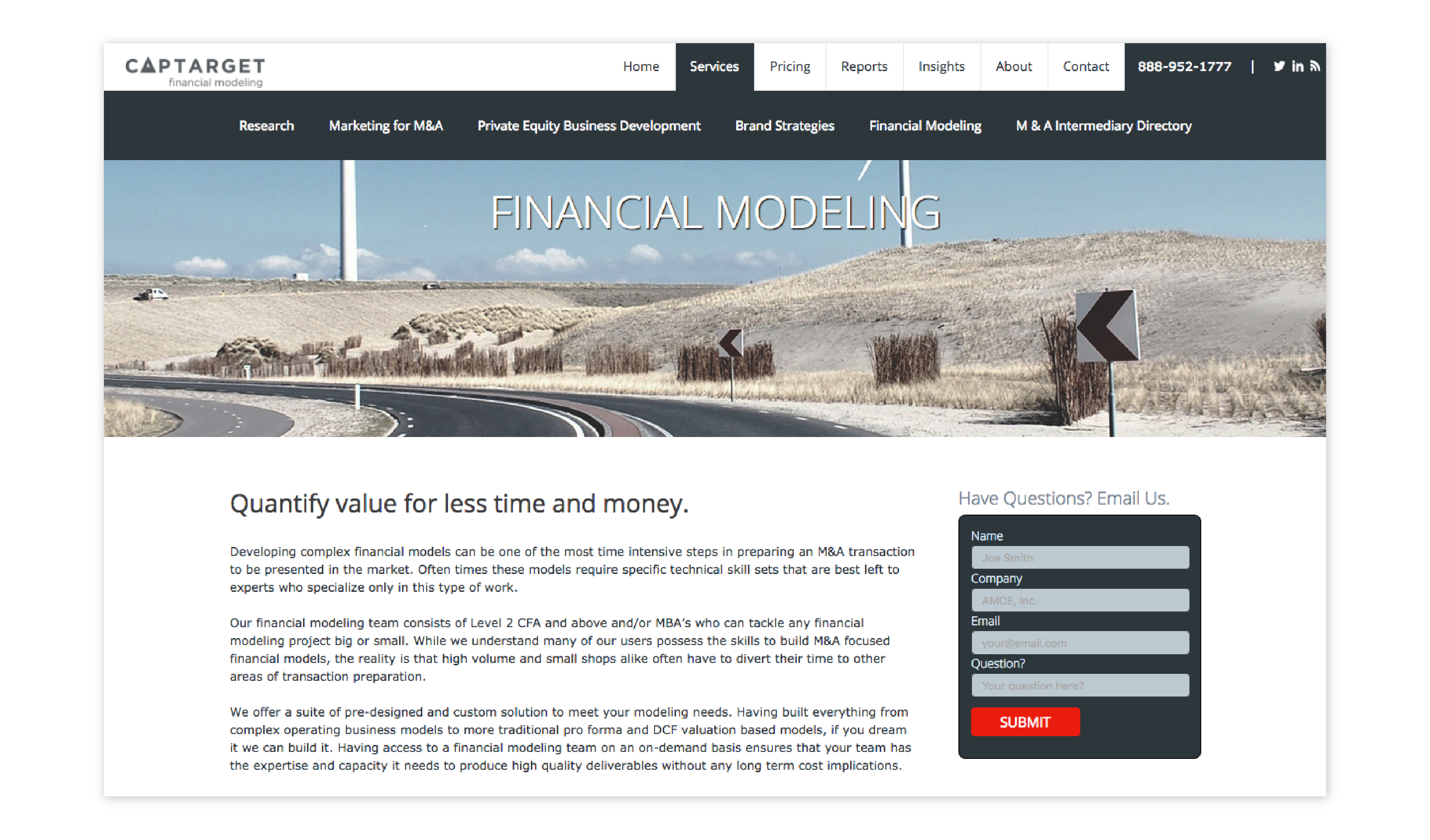
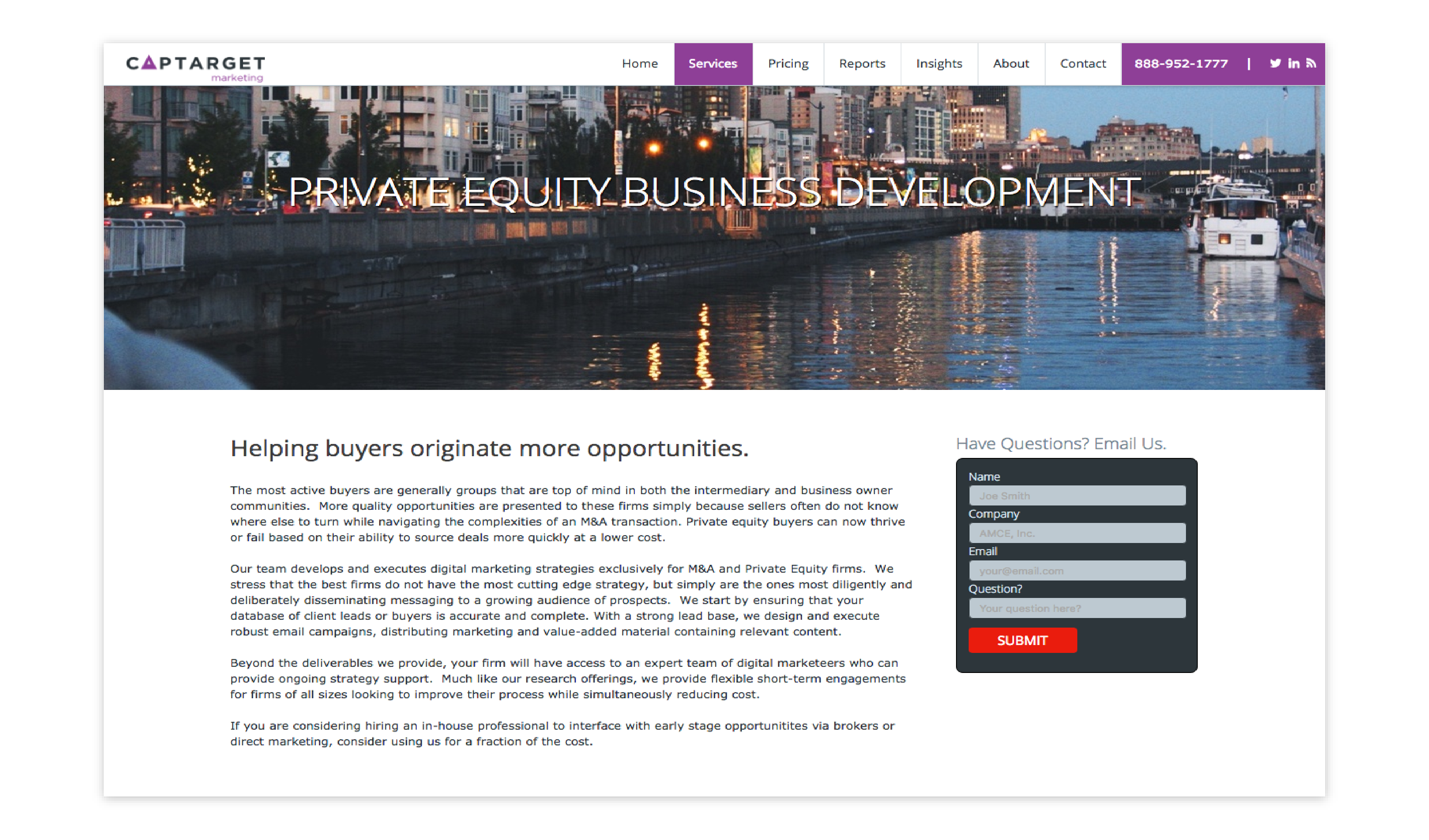
We later evolved the home-page to be more "fun".

So, how did Captarget become CAPTARGET?
It was always CAPTARGET, not Captarget (see logo). The little things matter.
